Charts and Graphs
Utilization
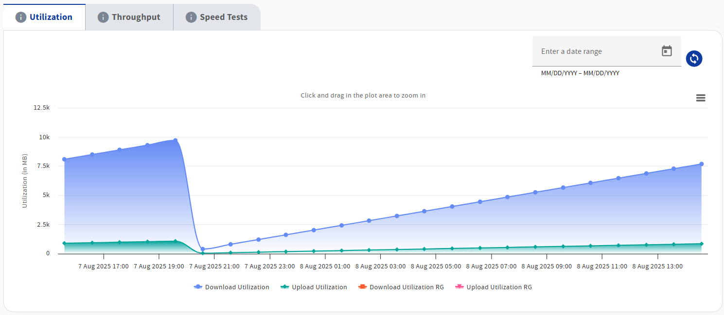
By default, the Utilization chart will show at the bottom of the Care Subscriber Details. This chart displays a time series chart of the previous 24 hours of the subscriber's usage, in Megabytes.
You can specialize the display to show only upload or only download usage by selecting the text label or colored dot in the legend below the chart.
-
Select Upload Utilization (or the green colored dot) to toggle the display of upload data on and off.
-
Select Download Utilization (or the blue colored dot) to toggle the display of download data on and off.
The datepicker in the top right corner of the graphs area may be used to select a specific time window in history. Time windows greater than 48 hours will show data in 1 hour intervals, while time windows smaller than 48 hours will show data in 5 minute intervals.
Throughput
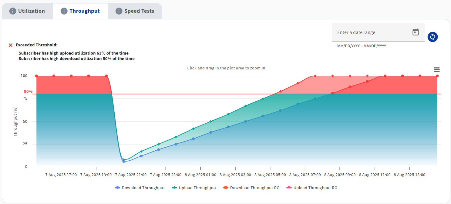
The Throughput chart can be viewed by clicking on the associated tab. This chart displays a time series chart of the previous 24 hours of the subscriber's percent throughput usage, with 100% being the subscriber's provisioned rate.
The red horizontal line is set at 80 % utilization. If either the upload or download curves exceed this threshold, the subscriber is likely to be experiencing a poor internet experience because consumption exceeds the provisioned rate.
WAN Saturation
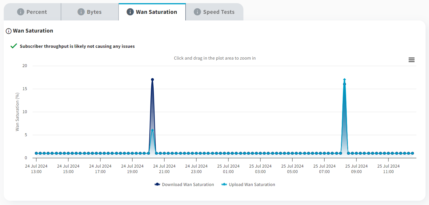
The WAN Saturation graph can be viewed by clicking on the associated tab. This graph gives an indiciation of how much bandwidth is being used by the router as a percentage of the latest speed test results. This graph is only present for Plume managed services.
Speed Tests
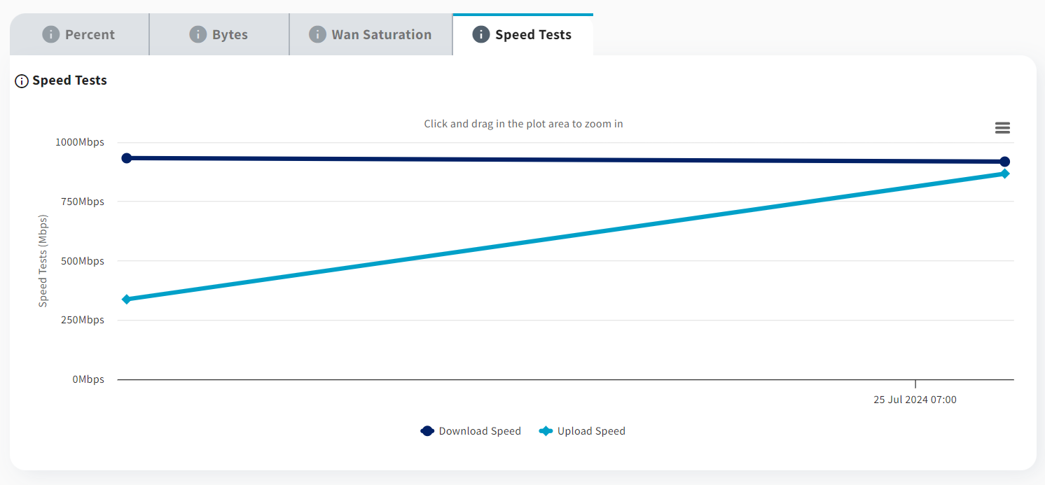
The Speed Tests graph can be viewed by clicking on the associated tab. This graph shows the speed test results over time for both upload and download. This graph is only present for Plume or Intellifi managed services.